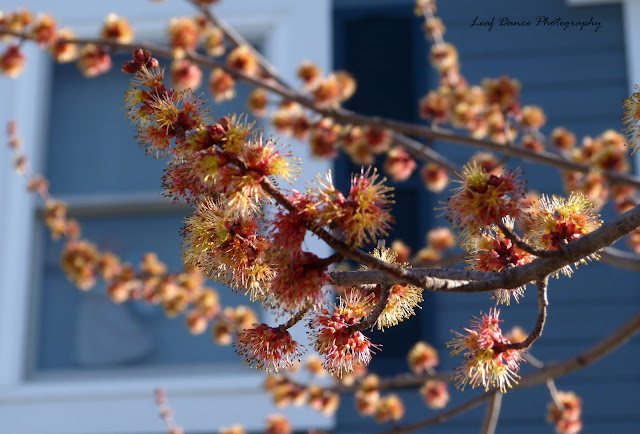
Well, this is a different kind of maple, not too different, but different enough that you can easily tell the difference by the different colored flowers and slightly smaller leaves. (Are you tired of the word different yet? I'll use a different word next time. =P )
Now these last five I would love your opinon on:
In these two, do you feel that the window adds to the picture . . . or takes away from it?
In these two, do you like the combined angle and focus . . . or are they too extreme and sort of confusing to you?
For this one, does it have understated simplicity (as opposed to the others that have blossoms bursting from every inch of the picture) or is just . . . uh, boring? I really can't decide whether I like it or not!
=D
Really, I have a bunch of pictures of this tree and I only want to keep the really good ones and not the "Well, it's Kind of Good, But I'm Not Sure, Yet I Don't Want to Delete it Since Someone Might Else Really Like it. . . "
Sooooooo, I'd love it if you'd tell me your thoughts. =)
God Bless!
~Jenny ♥


These blossoms look like those trees from the Lorax! You know, the truffula trees? :D That's pretty neat:)
ReplyDeleteAbout your questions; I think in the first photo the window adds to it because it is an interesting shape and the flowers seem to grow around the frame. In the second one, I don't see much benefit from composing the picture that way. But that's just me:P
The second ones; I seriously like the angle/focus thing you did:) the second one is my fav of the whole bunch!
The last picture may be too simple for me, but I like a lot of pop and snazz:)
Eli
SO BEAUTIFUL
ReplyDelete